If you’re interested in having a logo designed or updated, it’s helpful to know the five main types of logo and the value that each one offers. Each type has different advantages and disadvantages that are crucial to understand so it can perform well in a brand strategy.
In the logo design process, typically choosing one of these types would come after the strategy has been determined and before any creative elements like colors, typeface, or style have been determined.
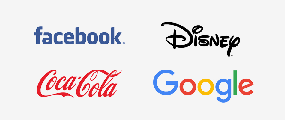
The word mark uses only a stylized type-face as the logo.
1. Word Mark
A wordmark is a font-based logo that can take on different feelings or meanings depending on the letterforms. This is a very strong choice if the name of the business is short and distinct on its own or if you’re a younger company looking to get your name out there.
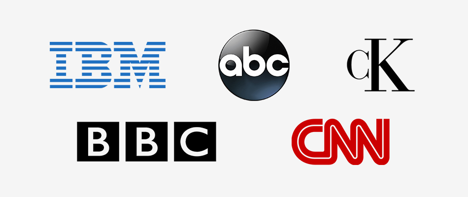
The letter mark uses stylized forms of the initials of the name of the company.
2. Letter Mark
Letter marks are similar to word marks in that they are only made of text; however, letter marks refer to logos that use an acronym or initialism. This is a great direction for companies with long names that are looking for a way to make their name more memorable and recognizable (e.g. NASA vs. National Aeronautic and Space Administration).
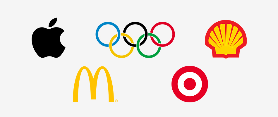
The brand mark is a non-typographic icon.
3. Brand Mark
These can be pictorial or abstract. A pictorial logo is a logo based on a recognizable image (e.g. Apple, Twitter, Target). An abstract brand mark uses geometric shapes with no specific physical counterpart.
These types of logos have the potential to be highly memorable and recognizable but often depend on pre-existing brand awareness due to the lack of text. When designed well, these can be the epitome of a great logo—communicating complex concepts with simple visual design.
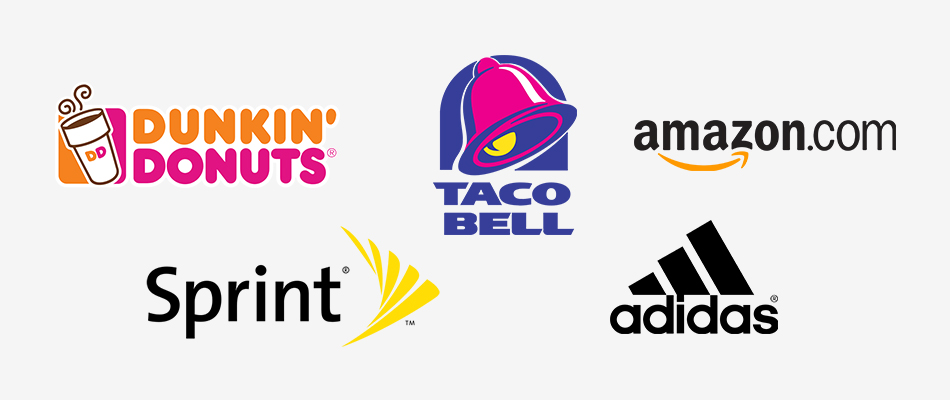
Combination marks merge a brand mark with a word mark into a single graphic.
4. Combination Mark
Combination marks are simply logos that pair a brand mark with a word mark to create a single combined mark. These are great for companies who need to have their name attached to the logo but want the advantages of using a brand mark.
When using combination marks, it’s not always necessary for the text to be “inside” the brand mark and in many cases, the brand mark and text can be arranged in different formats depending on its use case (e.g. brand mark to the side of text vs. on top of text). You can also use the brand mark on its own in certain cases—an app icon, for instance.
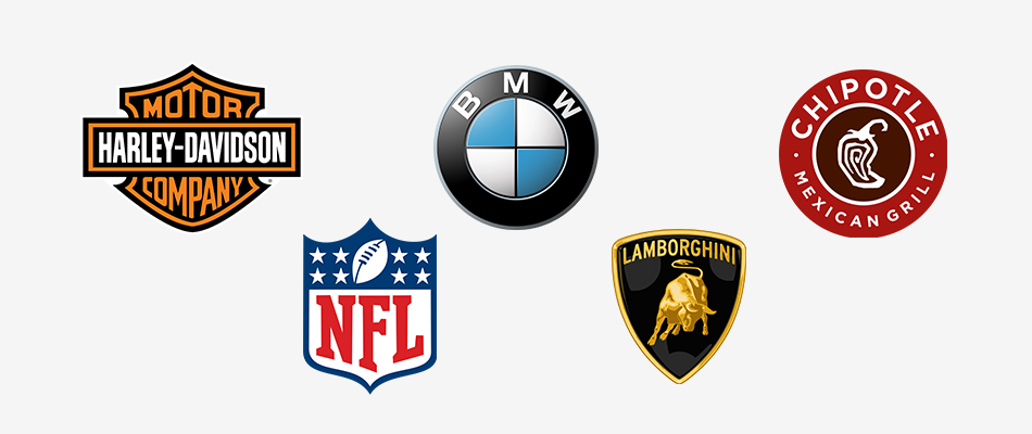
Emblem marks are an alternate take on a combination mark where the type is tightly integrated with the brand mark.
5. Emblem
Emblems are essentially combination marks, but the text is inside the brand mark. This is usually an alternative to the combination mark, where it’s important to have a single graphic instead of the combination mark which may have multiple components to it. This would be beneficial, for example, to an apparel company that wants a single mark that includes the name of the company in a distinctive graphic, which would be easier to print and embroider on their products.
Need a professional logo design?
We’d love to help you! Connect with us today and get a free consultation on how we can create a logo for you using our comprehensive design process.


