


Before we dived into designing the interface for the Kansas City Zoo’s website, we took a step back to work on the sitemap and content strategy.
Without a clear roadmap for a website’s content, structure, and overall flow, it’s nearly impossible to create an effective and intuitive navigation.
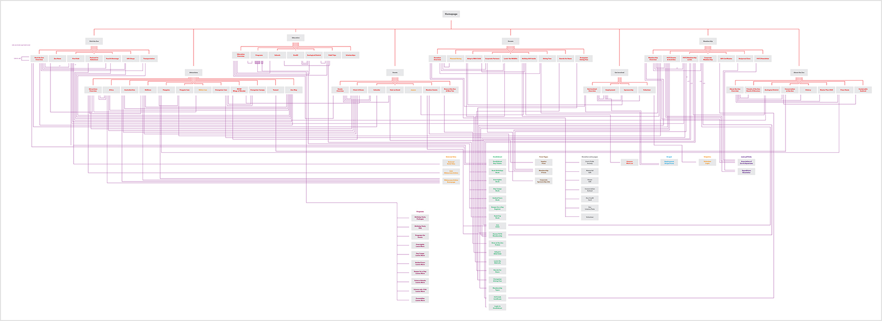
The Kansas City Zoo sitemap at the start of the project.
Step 1: Strategy & Sitemap
As part of our strategy process, we mapped out all of the Kansas City Zoo’s pages and content. This allowed us to get a big picture view of the website and helps problems in the sitemap to become clear.
In the case of the zoo, the problem revealed itself quite clearly. Content and pages were laid out and structured in a very confusing manner and the lack of an effective navigation resulted in page links that directed a user all over the site, which only added to the difficulty of the user interface.
The goal became clear that we needed to sort through the tangled mess of pages and link to find the core content and organize it in a way that made sense intuitively.
Force Ranking
The first step to organizing the sitemap was establishing content priority, or in other words, determining which content is more important. This is critical to content strategy as you need to know what’s most important to guide users to and what can afford to be less prominent.
We accomplished that through a process called force ranking. We guided the Kansas City Zoo team through this process which comparatively ranks each part of the website against each other and you end up with a ranked list of all the site’s primary content. In the case of the Zoo, we determined the top 5 most important pieces of content were:
- Location & Hours of Operation
- Ticketing & Pricing
- Zoo Attractions
- Events & Calendar
- Memberships
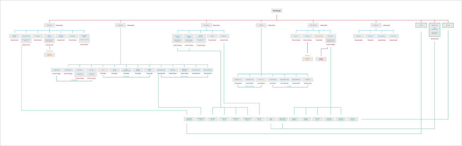
The new Kansas City Zoo sitemap based on our strategy process.
Taking the results of the force ranking process we were able to strategically determine what was most important to highlight in the main navigation and in which order we would display the list items. This resulted in a new sitemap which was much more clear, understandable, and optimized for user interaction.
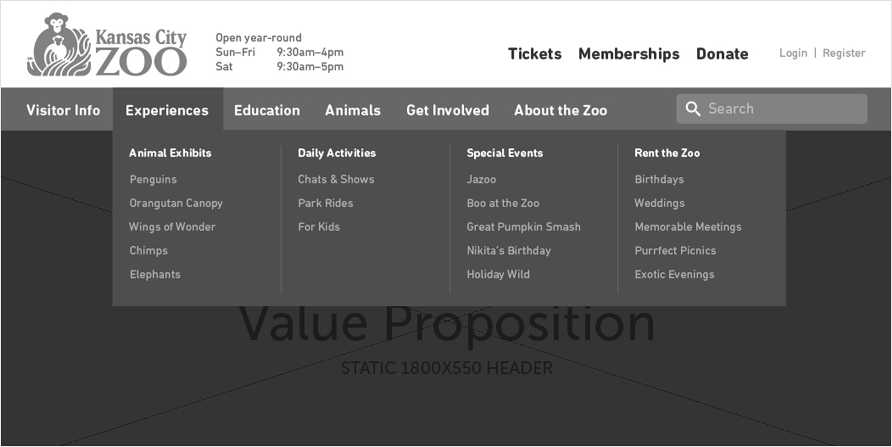
Wireframe concept of the new navigation based on what we learned from the sitemap.
Step 2: Wireframing
We then translated those conclusions into a wireframe (a rough draft) of the main navigation for the Kansas City Zoo. There were two major creative decisions during that process that were made to optimize user interaction and align with strategic goals.
The first was to separate key calls to action from the main interface into standalone buttons along the top.
The second was to develop multi-column dropdowns. The multi-column dropdowns allowed us to group much of the zoo’s attractions, events, and entertainment options into a single dropdown that made the content much easier to scan through and comprehend at a quick glance.
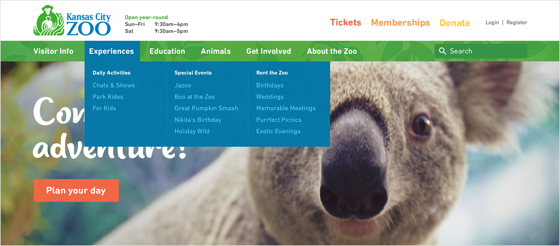
The final navigation design.
Graphic Design
This is the final design of the main navigation that fuctions as the centerpiece for the user interface of the Kansas City Zoo. We are very happy with the final result and are excited to see how the improvements make visiting the Kansas City Zoo website much more enjoyable and effective at engaging users.
Have a project that needs user interface design?
We’d love to work with you! Connect with us today and get a free consultation on how we can create a better digital interface for you.