Christ in the Rockies is a christian ministry and father-son adventure camp based in Colorado. Their primary goal is to promote authentic manhood through outdoor adventures and bonding activities.
Christ in the Rockies approached Light Up the Dark to create a new, modern website with up-to-date aesthetics and a mobile-friendly design. During our discovery phase though, we found that the branding and logo design needed a refresh as well.
The previous logo for Christ in the Rockies.
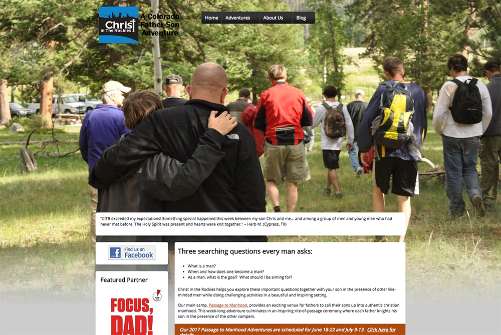
Christ in the Rockies’ website, before the redesign.
Brand Update
Before tackling the website, we decided to focus our attention on the brand, so that we could properly integrate the updated brand when it came to design the website.
While the old logo communicated the values that Christ in the Rockies was looking for (community, outdoors, adventure), it had several technical problems. The primary issue was scaling. The silhouette figures were too small to be seen when the logo was reduced in size and it lost much of its impact. Additionally, the typeface was a bit out of date and its position in the logo made it inflexible for different use cases.
The updated logo for Christ in the Rockies with improved usability.
After several revisions, we landed on the new logo for Christ in the Rockies. Conceptually, it is the same logo but redrawn to address all of the technical concerns. The silhouette figures were drawn larger, with more separation and clearer definition. The mountains were made more prominent and used to frame the men. Finally, we separated the name from the icon for a more flexible logo system with multiple lockups.
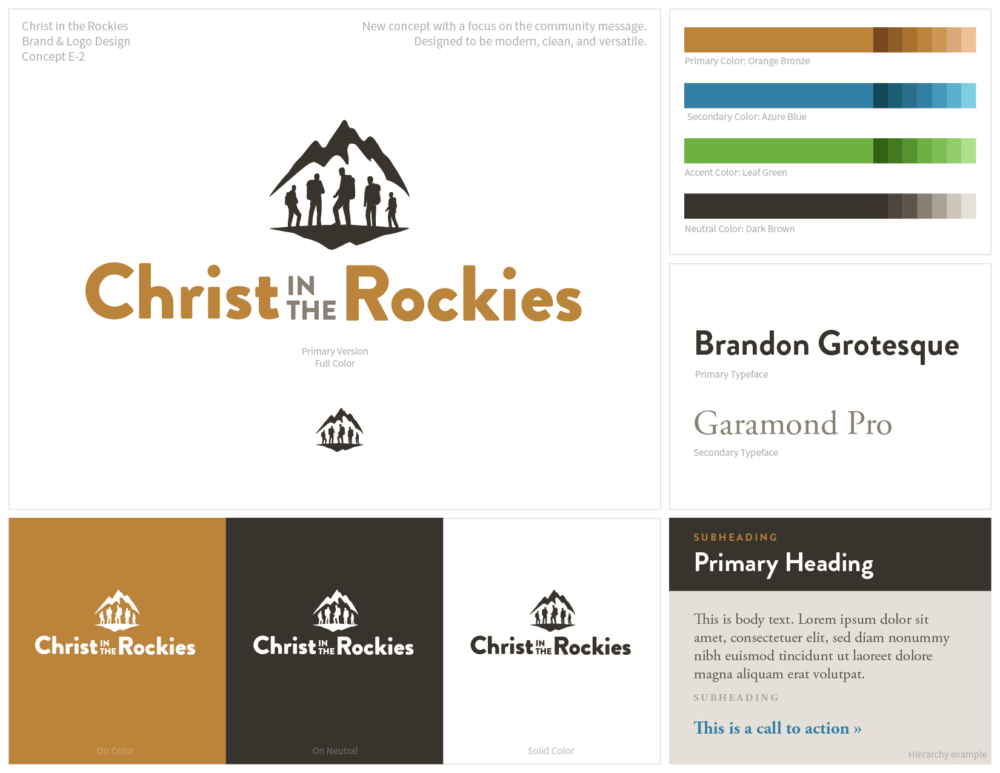
The brand board for the refreshed brand with new color scheme and typography.
We also refreshed the color scheme and typography with a new look. The colors adopted a neutral earthy brown scheme with vibrant blue and green accents. Brandon Grotesque and Adobe Garamond Pro were selected as the typefaces to strike a balance between modern and timeless.
Wireframing the website
With the logo and brand design updates completed, we set our attention on creating the new website. Our primary goals were:
- Create a strong user flow that promotes registration for their annual camps
- Convey effectively the sense of adventure and personal growth experienced at their events
- Provide easily accessible information about their programs
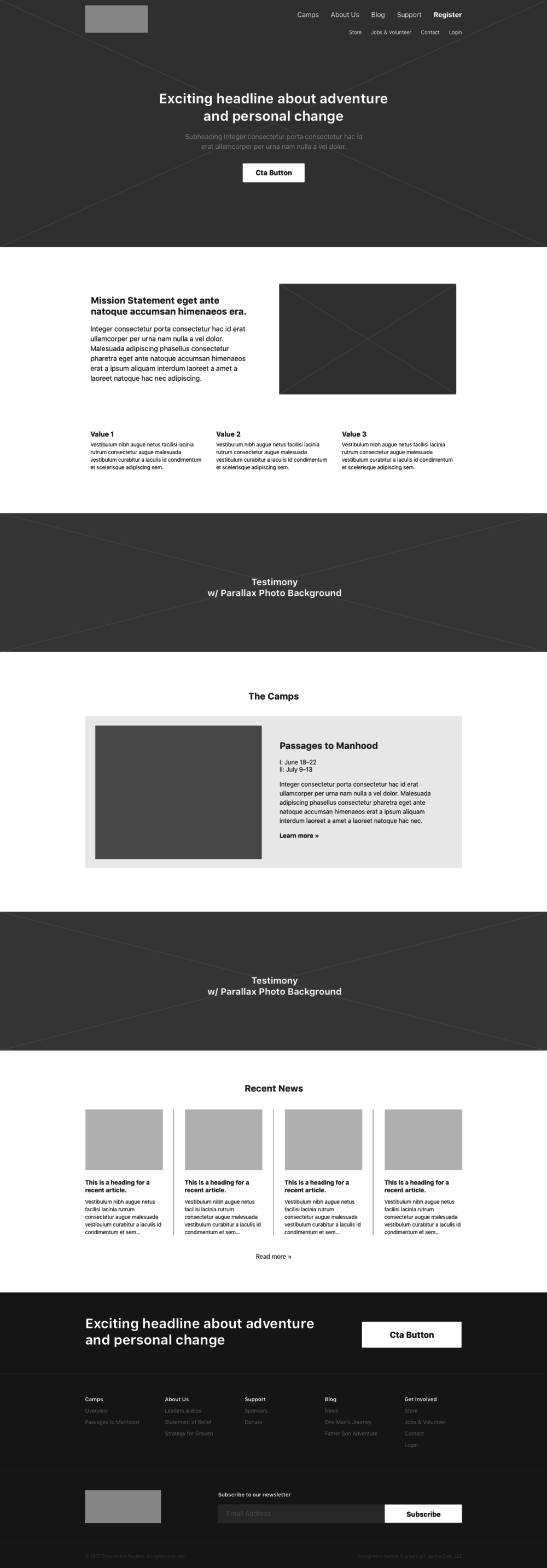
The wireframe of the user interface developed from our strategy process.
We always begin our web design process with a wireframing stage. This is where we focus on the basic layout and structure of the pages and determine the user interface. Wireframes are basic in nature, making them quick to create and easy to revise and iterate.
For Christ in the Rockies, we used the wireframing stage to develop the split navigation. We placed primary user actions in the top row and placed secondary actions in the second row. This saves horizontal space and allows for a more easily understood design.
Another example of a decision made during wireframing was the homepage layout. After the hero banner, we decided to dedicate the first section to an about section explaining the mission of Christ in the Rockies and their values. This was a strategic move to connect with people who share the same values, which is critical for reaching their target audience. This also creates a baseline understanding of why someone would attend their camps.

The final design of the Christ in the Rockies site with the new brand integrated with visual elements.
Design phase
The design phase is where branding is integrated into the wireframes and other visual elements like photography, illustrations, and icons are added. At this point, with the layout and content locked in, it becomes a straightforward process of determining the aesthetic qualities of the site.
One of the design decisions our Kansas City web design team made was to use a background video for the main banner on the homepage. Research has shown that video backgrounds are great for engaging users and communicating values effectively. Videos in general are very effective marketing tools and putting it into a silent video background is an unobtrusive way to play one automatically.
We are very excited with how the new brand and website for Christ in the Rockies turned out look forward to seeing them succeed.
Looking for professional web design?
We can help with your project! Connect with us today and get a free consultation on how we can design and develop your website.


