When approached with refreshing and unifying the branding for the Kansas City Zoo, we started by aiming our sights at the logo.
The old version of the Kansas City Zoo logo.
Evolving a logo
As we worked alongside the marketing team at the Kansas City Zoo, we decided that it would be best to explore an iterative evolution of the logo, rather than explore an entire redesign.
Taking the approach of evolving the logo, as apposed to a new concept entirely, allows a brand to preserve any historical value as well as maintain any momentum the brand currently has. Additionally, a complete redesign can be very costly to implement.
This was the case with the zoo, where the logo was very prevalent in park signage and park facilities. A new logo needed to allow for a gradual integration alongside their old logo.
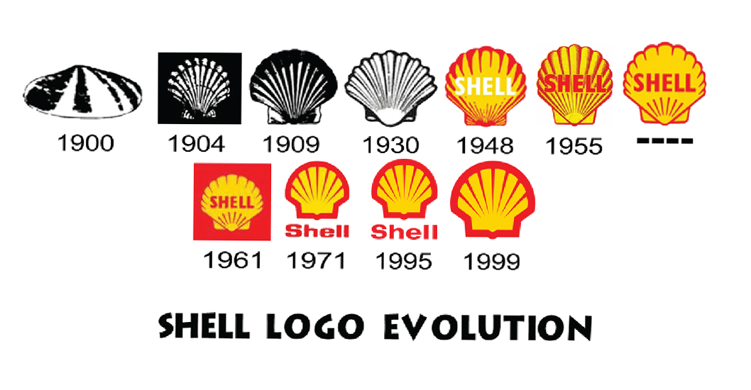
An example of how a logo evolves.
With the goal of evolving the current logo in place, we set out to address all of the technical issues with the logo.
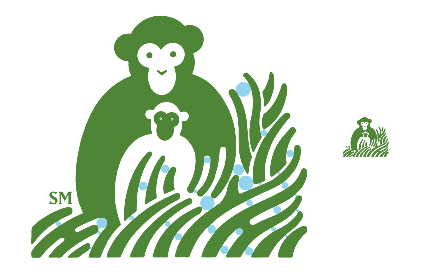
The logo had inconsistent negative space between objects, creating an uneven and disjointed logo.
Problem 1: Negative Space
One of the first issues we identified with the logo was the negative space between the blades of grass under the monkeys. It’s critical to not only look at the positive space in a logo (the parts with color and definition) but also the space between them and how they affect each other.
In the case of the Kansas City Zoo, the space between the blades was inconsistent, resulting in an uneven, almost “lumpy” appearance. The logo also performed very poorly at small form factors due to the inadequate space between some of the blades which caused certain blades to blend at small sizes.
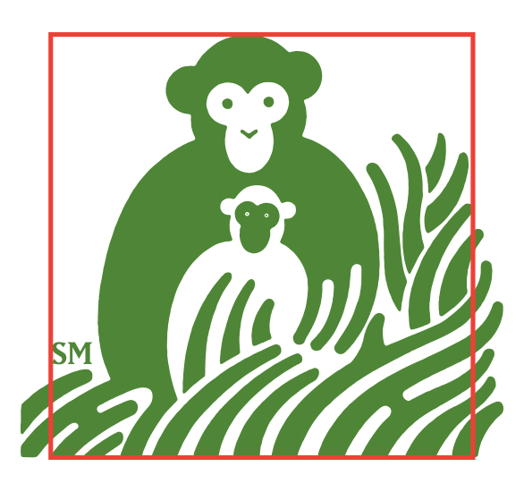
Balance is critical in a logo and many of the shapes in the old logo didn’t work together well to create flow and balance.
Problem 2: Balance and Flow
The second issue we addressed was the awkward balance and flow of the logo. Due to the way that the grass flows to the right, it draws the eye off to the right – away from the monkey and the logo. By changing the way the grass wraps around the monkey, we can guide the eye to stay on the logo and feel like it doesn’t have to move away.
The blades in the lower left corner also blend with the monkey and compromise its shape, making it less distinctive.
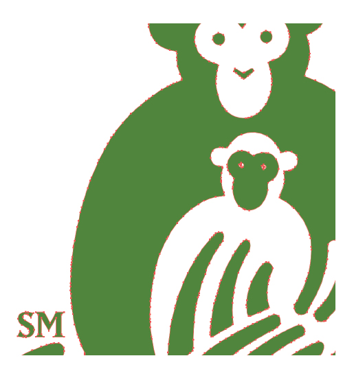
Uneven curves due to overuse of anchor points.
Problem 3: Anchor points
Another problem we found was the construction of the old logo. It had been poorly vectorized and had far too many anchor points. This can result in uneven curves and angles and generally creates a less clean logo.
We decided to recreate the logo from the ground up using fewer, more precise anchor points to create cleaner and sharper curves and angles.
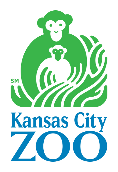
The final version of the logo after editing.
The Final Result
This was the final revision of the logo after the design process. On top of correcting all of the technical issues we identified, we wanted to give the logo a slight modern facelift by refreshing the color to a brighter, vibrant green. We were very happy with the final result and are excited to see how the new logo will spearhead the new and revised branding for the Kansas City Zoo.
Looking for a better logo?
We can help! Connect with us today and get a free consultation to learn how we can take your logo design to the next level.


