When we were approached with redesigning the website for the Kansas City Zoo, it became apparent that their brand was in need of a more modern, defined visual identity. They had a well established logo and brand but it was agreed that an update was due.
Without a style guide, we recognized that the brand could use a little TLC to bring their marketing effectiveness and park experiences to the next level.
During the strategic planning of the website, we proposed refreshing their brand so they could launch an updated visual identity for the zoo along with their new website. They agreed and we excitedly set to work to polish up the Kansas City Zoo brand.
Updating the logo
The first part of the brand we tackled was the logo. We were very happy with the new logo that we landed on.
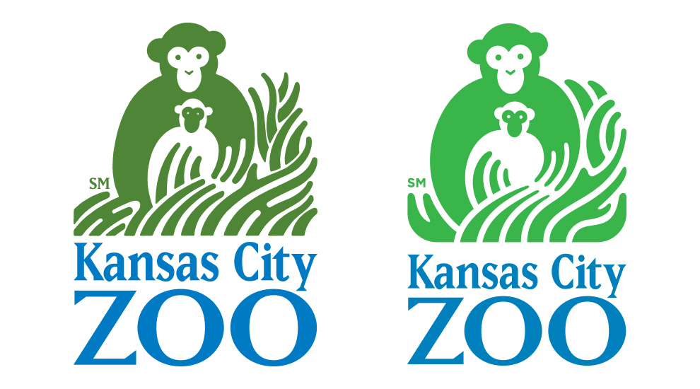
The Kansas City Zoo logo before and after our design process.
You can read about our process for updating the design of the Kansas City Zoo’s logo here. »
Building a color palette
As we developed the design for the logo, we started to focus on the color palette. The blue and green color scheme had already been well established in the park signage and assets so we decided to stay in the same neighborhood and focus our attention on modernizing the colors.
We liked the brightness and vibrancy of the blue but the green didn’t share the same qualities so we started to experiment with alternatives.
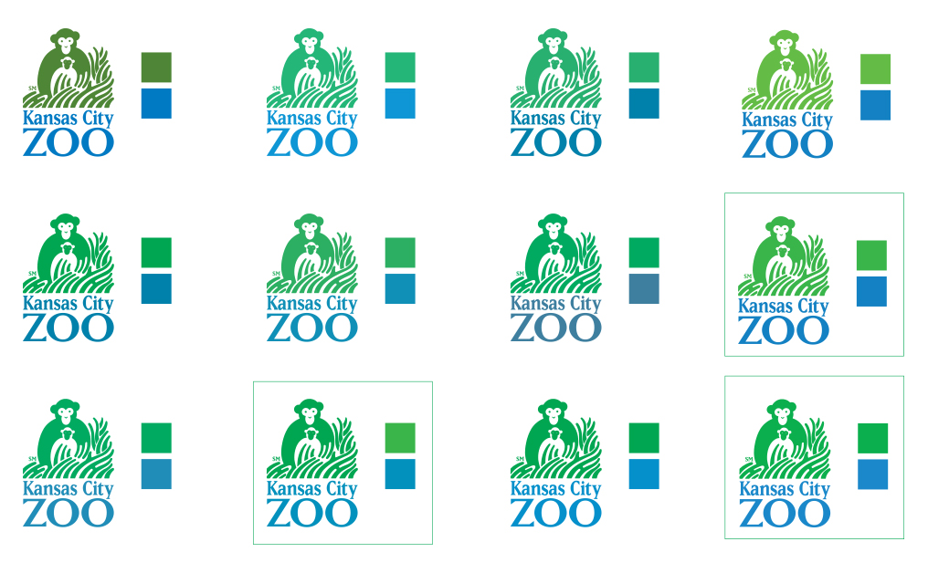
Experimenting with colors using the Kansas City logo.
We looked at several options for updating the green to something more modern and fresh. We narrowed down our top picks and then made a final decision based on how it worked with the blue in different color scheme arrangements.
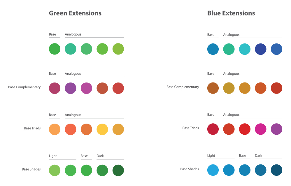
We explored dozens of color options before we narrowed our selection down to a set of core primary and accent colors.
Using the green and blue as our primary colors, we then extrapolated complementary and accent colors and started to flesh out the full color scheme. We selected specific colors that worked together harmoniously and embodied the liveliness we wanted to capture.
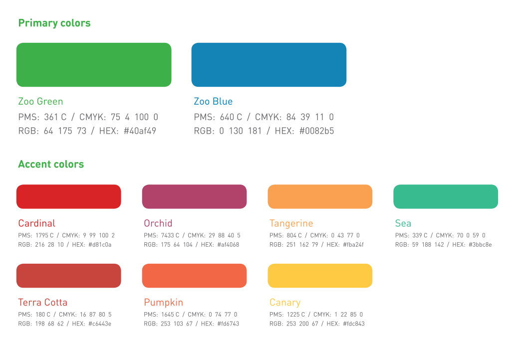
The final color scheme that we landed on for the Kansas City Zoo brand.
Selecting typefaces
At the time, the Kansas City Zoo didn’t have a brand typeface and their current assets offered little in the way of guidance. Having a brand typeface is integral to a brand for maintaining consistency and style across all mediums so we immediately set out to land a system of fonts for the zoo.
With pretty much a clean slate, we considered dozens of candidates before we narrowed on a set of four typefaces we believe embody the brand and voice of the zoo and would provide the versatility to meet all of their typographic needs.
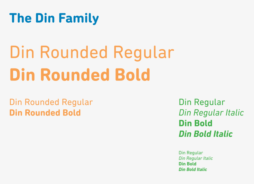
Din and Din Rounded were chosen as the primary typefaces of the brand.
The four typefaces we selected were Din, Din Rounded, Lifehack, and Lithos.
We selected Din to be the primary typeface and all-around workhorse for the brand, being used for content like body text and body headings. Din Rounded was chosen to be used in tandem with Din as the primary heading typeface. Din was chosen for its beautiful modernism, clarity, and robust font family.
Din Rounded added a playful informality that was ideal for an ‘edu-tainment’ attraction like the Kansas City Zoo that needs to project a fun, approachable, and vibrant tone. Din Rounded embodies those qualities wonderfully while also being very functional and flexible.
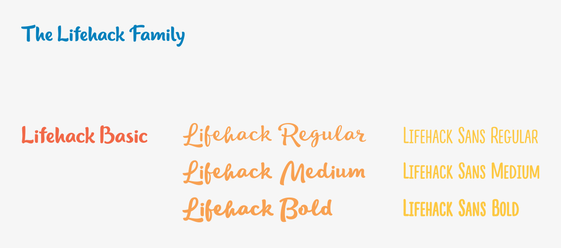
Lifehack Basic was selected as the primary display font.
While Din works wonderfully as a foundation for a type system, an attraction like a zoo requires more variety in its visual language so we selected Lifehack Basic as the primary display font. As a display font, it is strictly used for large headings that need to convey that extra mile of personality.
Lifehack Basic fulfills that role and exudes adventure, energy, and spectacle with its lively strokes and semi-calligraphic letter forms. It perfectly captures the theme of “wild and fun nature” that a zoo would want to communicate.
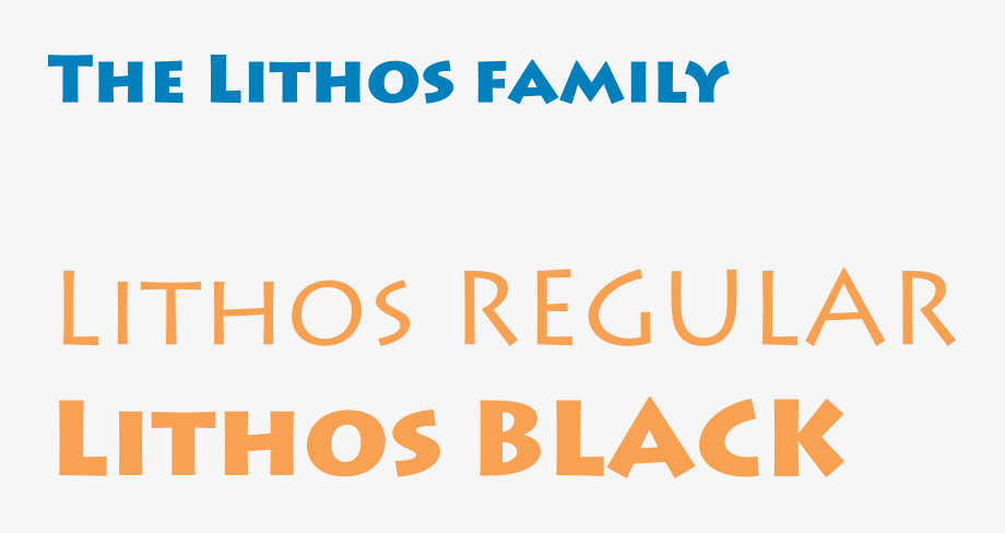
Lithos was added as an alternate display typeface.
To round off the brand typefaces we added Lithos as an alternate display typeface. It pairs nicely with Lifehack Basic by contrasting it with its straight angles and sharp strokes. Lithos also possesses that quintessential “safari” style that lends an air of historical timelessness.

The complete brand in action.
Bringing everything together
We are very happy with how the brand for the Kansas City Zoo came together and we are excited to see it in action. We believe it fully captures the sense of wonder, adventure, and joy that a trip to the zoo brings and we were proud to contribute to a staple of Kansas City culture and tourism.
Need to rebrand your business?
We’d love to work with you! Connect with us today and get a free consultation on how we can create a better visual identity for you.


